One column layout
What participants see with One column, on a computer and on a phone, and when to choose it over Two columns.
1 min read
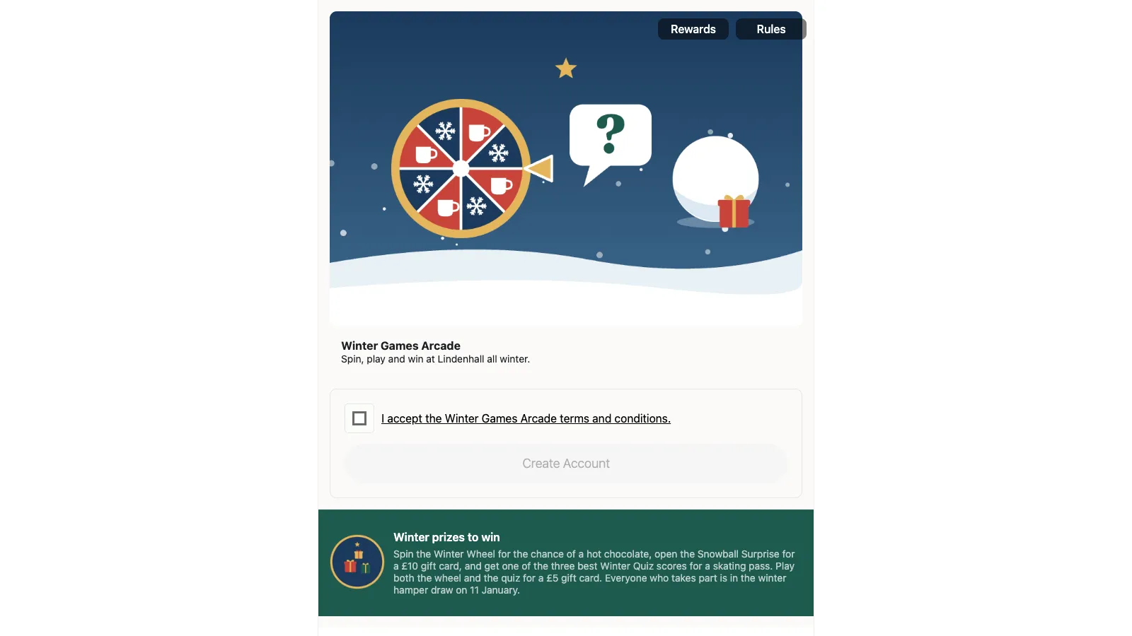
With One column, the landing page is a single stack in the middle of the screen, on a computer as on a phone. It reads top to bottom in the same order everywhere: the header and sign-up button, the prize summary, the listing sections, the instructions, then the closing button. Here is the Winter Games Arcade switched to One column.
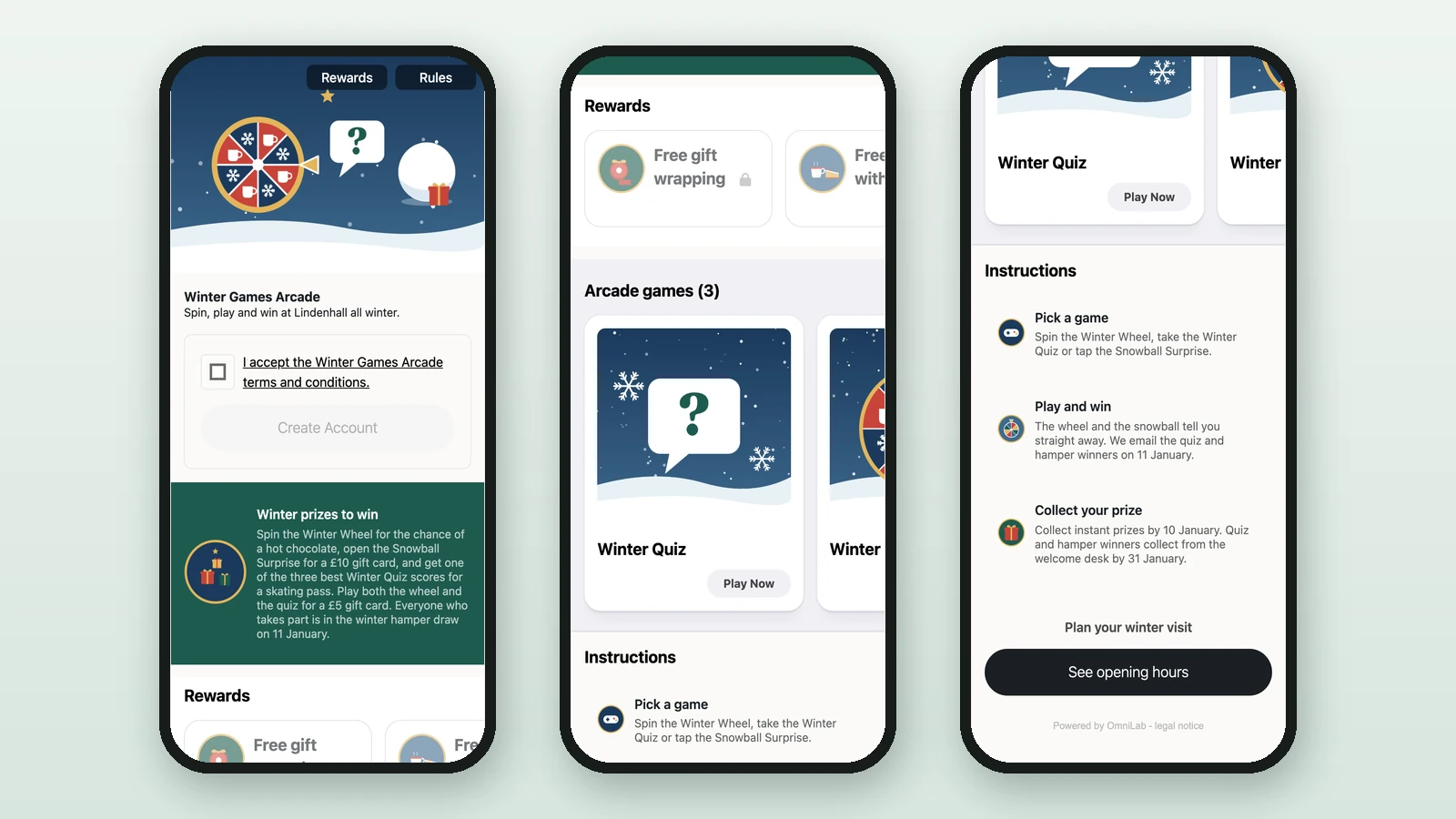
On a phone it looks the same as Two columns.
When it fits
- The campaign has few games or events, so a second column would sit half empty on a computer.
- You want computer visitors to read the page in the same order as phone visitors.
With several games or events, Two columns keeps them all in view on a computer.
To switch, see Choose a layout. The order and visibility of the listing sections are set in the landing page editor: see Landing page reference.