Scans over time
Use the OmniLab Smart Link time-series chart to spot launch peaks, sustained traffic, and unexpected drops.
See when your traffic peaked and when it faded, so you can time your next push and spot placements that are running out of steam. This page explains how to read the Scans Over Time chart and which patterns matter most day to day.
What the chart shows
Scans Over Time plots a OmniLab Smart Link's activity across the Start Date and End Date you choose in the analytics view.
It helps you answer questions such as:
- When did traffic spike?
- Did a launch create one burst or sustained activity?
- Did traffic slow down after the first few days?
- Did one update or placement change improve performance?
Scans Over Time sits at the top of the analytics page after you select Run.
How to read the pattern
| Pattern | What it often means |
|---|---|
| sharp spike at launch | A poster drop, email send, or campaign announcement drove immediate attention |
| steady traffic over several days | The OmniLab Smart Link is being discovered continuously across one or more placements |
| sudden drop after a peak | Launch interest faded, a placement was removed, or the campaign needs another push |
| repeated smaller peaks | Traffic may be linked to recurring pushes such as social posts, store events, or newsletter sends |
What to compare with this chart
The chart becomes more useful when you read it alongside the other parts of the analytics page:
- Compare it with Scans by Variant to see which placement caused a peak.
- Compare it with Top UTM Sources to see which tagged source may explain the lift.
- Compare it with Top Referrers when traffic comes from websites, partner pages, or newsletters.
Good operational uses
Use Scans Over Time to:
- confirm whether a new print placement actually started driving scans
- measure the effect of a new email or social post
- spot when a high-performing placement is losing momentum
- decide when a QR asset needs fresh promotion or a new distribution push
A practical example
Imagine one OmniLab Smart Link is used on:
- a storefront poster
- a newsletter CTA
- a partner event stand
If the chart shows a sharp peak on the day the newsletter was sent, then flatter traffic after that, you know email created the burst. If the chart keeps climbing during the partner event weekend, the event placement is likely adding sustained volume.
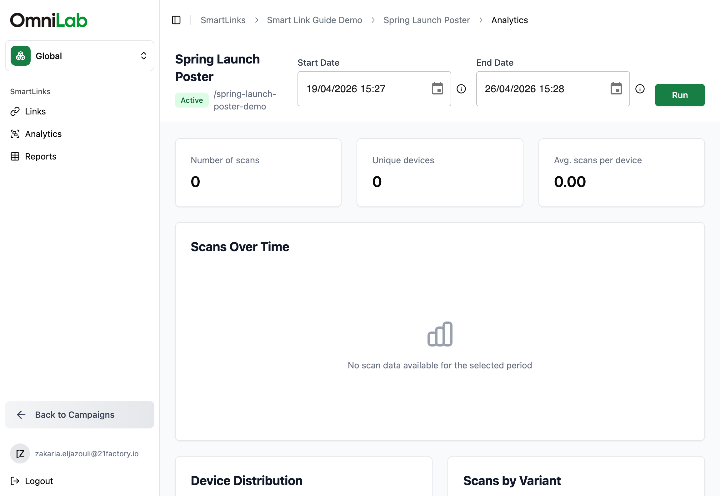
When the chart looks empty
When you expected traffic but the chart shows no activity:
- Confirm the Start Date and End Date.
- Make sure you are analyzing the right OmniLab Smart Link.
- Check that people are going through the OmniLab Smart Link, not sharing the final destination directly.
- Run a fresh test scan, then recheck the analytics.
Related
OmniLab Smart Link Analytics
Run the full per-link analytics page and understand where this chart sits in the wider reporting view.
Scans by variant
Use variant data to explain which placement is driving the traffic pattern you see.
Tracking gaps
Diagnose missing or incomplete activity when the chart does not match your launch reality.